Trusted by Leading Brands
Trusted by Leading Brands
From startups to established names, we’ve helped teams build visuals that work.

Shawama.com
Shawama.com
Shawama.com is a bold, Afrocentric food brand that reimagines shawarma with a streetwise, modern edge. The client approached me to develop a unique brand identity that could capture their vibrant urban personality and elevate the experience of fast food through strong, memorable visuals.
Shawama.com is a bold, Afrocentric food brand that reimagines shawarma with a streetwise, modern edge. The client approached me to develop a unique brand identity that could capture their vibrant urban personality and elevate the experience of fast food through strong, memorable visuals.
Date: 2025
Date: 2025
Client: Shawama.com
Client: Shawama.com
THE CHALLENGE
THE CHALLENGE
This project came with a unique communication challenge.The client struggled to articulate their vision and preferred to decide based on visual exploration rather than upfront descriptions. This created an unclear direction and led to a few rounds of feedback.
This project came with a unique communication challenge.The client struggled to articulate their vision and preferred to decide based on visual exploration rather than upfront descriptions. This created an unclear direction and led to a few rounds of feedback.

LOGO CONCEPT
LOGO CONCEPT
The shawama.com logo mark is a combination of its initials (i.e letter S and letter C) which are formed into an abstract shape to form the sha-wama roll. The angles represents movement, making the logo feel dy-namic. The logo design maintains a friendly and modern tone. The balance of sharpness and softess reflects both the vibrant nature of street food while maintaining its professionalm. The logo is minimal and easily recognised.
The shawama.com logo mark is a combination of its initials (i.e letter S and letter C) which are formed into an abstract shape to form the sha-wama roll. The angles represents movement, making the logo feel dy-namic. The logo design maintains a friendly and modern tone. The balance of sharpness and softess reflects both the vibrant nature of street food while maintaining its professionalm. The logo is minimal and easily recognised.

BRANDING
BRANDING
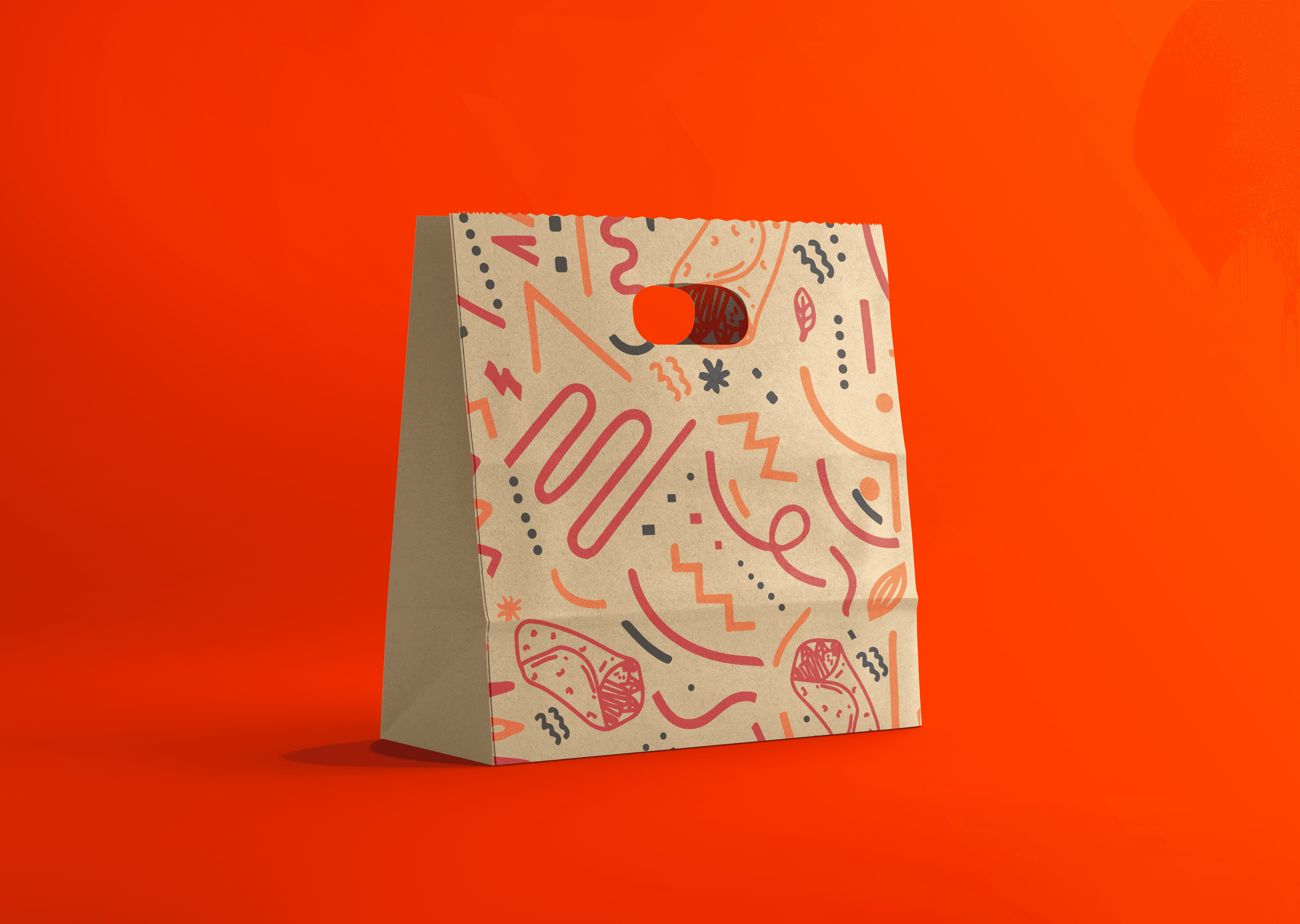
To Africanize the brand, a custom pattern was created by combining shawama-themed doodles with traditional African line shapes. This unique blend reflects the fusion of rich flavors.
To Africanize the brand, a custom pattern was created by combining shawama-themed doodles with traditional African line shapes. This unique blend reflects the fusion of rich flavors.